“To make a good job of a poster it must be well designed, but for goodness sake do not drag it into the mud by calling it ‘Art’.”
(Gregory Brown, Commercial Art, June 1928)

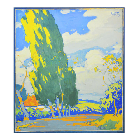
For my money, Frederick Gregory Brown was one of the most influential poster artists of his generation. Largely eclipsed by the designers he helped to inspire, Brown’s status as a pioneer of British commercial art has, until recently, been under-acknowledged. But this was not always the case. In the 1920s and 30s his work was frequently, and favourably, reviewed in the pages of design journals like Commercial Art and Gebrauchsgraphik, where he was positioned alongside Edward McKnight Kauffer and Tom Purvis as being at the very forefront of British talent. He was also well-known to the public thanks to his distinctive (and at times controversial) poster style, which appeared both on the hoardings and in touring exhibitions. As an example of his fame, the Yorkshire Evening Post was advising readers in 1927 to decorate their newly-built suburban homes with the latest Gregory Brown designs cheaply acquired from the railway companies and cut down for framing!

Unused poster design, c.1916
The son of an art master and grandson of a printer, Brown started out as a decorative metal worker but soon shifted to commercial design. His first significant commission came from London Underground in about 1915 with a brace of posters which introduced the Capital to his dramatic use of flat colour, simplified forms and unreal colourisation. The following year he produced an even more striking set of six designs for the Underground’s tram and bus network, promoting the prosaic charm of destinations such as Hatfield (below) and Lambourne End.

Although the use of flat colour had been long established for poster illustration, it was Brown’s startling use of colour which was to mark him from contemporaries. For all of the avant-garde daring of the Underground’s famed commissioning programme, only McKnight Kauffer and possibly Walter Spradbery came close to offering the travelling public such vivid, and challenging, representations of nature at the time. This was not, of course, universally popular. A comic poem published in the Manchester Guardian during the twenties bemoaned the lack of realism displayed on the hoardings, concluding “the posters seem to show/ The country ain't no more the place I used to know/ For the sky is pink and the fields are mauve/ And the cottages all turned yellow/ enough to stun a fellow/ Oh, I want to see the country/ And I wouldn't mind where I went ter/ So long as I knoo the trees weren't blue/ And the cows all turned magenta !" But the critics loved it, and over the next twenty-five years Brown established a client base that included the Empire Marketing Board, railway companies, ICI, MacFisheries and department stores Bobby & Co. and Derry & Toms. He was also supremely versatile, successfully turning his hand to textile design, landscape painting and book jacket illustration.

Posters for Bobby & Co., 1920s
Throughout his career Brown remained an outspoken critic of the advertising industry, using his membership of the Design in Industry Association and the Royal Society of British Artists to blast ill-informed and unimaginative commissioning. He was especially critical of advertising managers who interfered in the design process or who failed to appreciate the difference between fine art and good design. Writing in 1933, he claimed that “the hoardings of this country are, in spite of a few notable exceptions, an insult to the public intelligence and a disgrace to Poster Art”. All of which could make him difficult to deal with. Cuthbert Grasemann, the Southern Railway’s Public Relations Officer, thought Brown was “as temperamental as a prima-donna and sometimes screams as loudly”. He was certainly a perfectionist and won critical acclaim for both his commercial work and solo shows at the Burlington and Whitechapel galleries.

Posters for Southern Rly (1926) and London Underground (1931)
Although hard to find, original copies his posters can be bought today for between £300 and £2000. We are currently offering several designs including Hatfield from his 1916 breakthrough commission and a previously unseen (unused?) lithograph for Somerset. In contrast, original artworks by Brown rarely come onto the market, and we are delighted to offer two gouache poster designs. The first is almost certainly an unused design from the 1916 Underground series. Like the published posters from that period it features beautifully drawn and surreally coloured trees against an inviting rural background to tempt the day-tripper. The second is another unused design probably from his unpublished 1918 National War Savings Committee commission, which shows a seventeenth century English galleon with a flotilla of modern warships. Both designs are signed ‘F. Gregory Brown’ (he dropped the ‘F’ in about 1922) on the front and ‘F. Gregory Brown RBA 19 Fitzroy Street W.’ on the reverse.

Unused poster design, c.1918
For more information about F. Gregory Brown read Unashamed Artists. A Celebratory Miscellany on Advertising Art, by Ruth Artmonsky (London, 2014). In addition to his many interviews with contemporary art and design magazines, Brown also published a practical handbook for budding artists, How to Draw Trees (The Studio, 1940). Examples of his posters can be seen at the Victoria & Albert Museum, London Transport Museum, Imperial War Museum and the National Railway Museum.

Book jacket design, 1933


Comments on post (1)
Barbara Stokes says:
I was interested to learn about F. Gregory Brown, especially that he was a poster designer. My father gave me many years ago an ink and white gouache sketch of the divine Sarah Bernhardt, signed in the top left corner in what appears to be the same ink used in the sketch. On the back is Mr. Brown’s name, an address in Stoke Newington and “T.Ps Weekly”. Did he ever do any other work like this? Barbara Stokes
Leave a comment