Think of Blackpool and chances are you’ll think of the Tower. Or the piers. Or the Illuminations. Or the Pleasure Beach. Or the Golden Mile, Blackpool Rock, the Winter Gardens and a host of popular entertainments that have made the town Britain’s premier seaside resort. But it was not always so. Blackpool’s rapid rise from obscurity to the holiday destination of choice for millions was a triumph of entrepreneurial flair and clever marketing.
Below are 14 posters charting the promotion of the Lancashire town from the 1890s to the present day. Although the fashions change one constant remains: the development of a clear visual brand, centred on the famous Tower and promising fun and escapism for all. In this way, Blackpool was able to distinguish itself from rival resorts and became the epitome of the British seaside holiday.
Health & Pleasure, Glorious Sea, Midland Railway, c. 1890
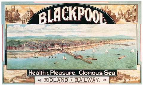
At the beginning of the nineteenth century Blackpool scarcely existed as a place at all. Yet 100 years later it was welcoming over 4 million visitors a year. Central to its unparalleled success was an almost aggressively entrepreneurial attitude on the part of local business men and civic authorities alike in creating world-class visitor attractions, coupled with a pioneering approach to advertising that was hugely influential on other UK resorts. By 1870 a dedicated Trade Council was buying advertising space at railway stations throughout the north west, while in 1879 the Corporation received unique powers to raise advertising revenue from local taxation. This gave Blackpool a definite edge over its rivals, which was exploited with blanket poster advertising across the UK and even as far afield as the Continent and the USA.
When this poster was published in about 1890, the Corporation was distributing 5,000 posters a year. From the start, the council worked closely with railway companies to raise awareness of the new holiday destination. But a clear brand had yet to be established. Instead, Blackpool is depicted here as a rather genteel looking coastal spa, complete with broad boulevards and respectably dressed tourists. Missing is the Tower (opened in 1894) and the sense of fun that was to characterise later posters.
Blackpool, John Hassall, 1907
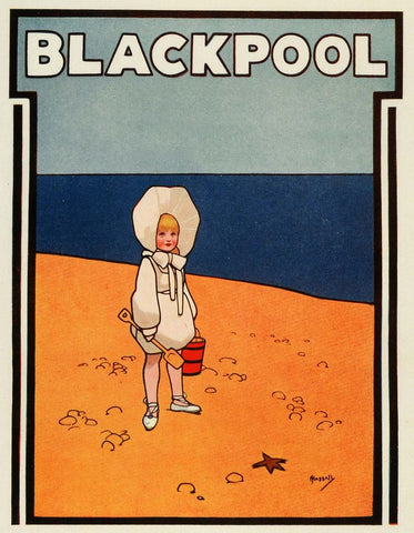
In its search for a distinctive and modern poster style, Blackpool Corporation despatched a deputation to the Continent in 1903 to hunt out the best in contemporary design. But their findings were not welcomed by fellow councillors, appalled by the lewd depictions of women in the posters they were presented with. Instead, the Corporation’s Advertising Committee established an annual poster competition to encourage submissions showing “a proper regard for the respectability of Blackpool’. This didn’t mean, however, that the town rejected designs by leading commercial artists. In 1907 the Corporation reportedly paid the ‘Poster King’, John Hassall, 140 guineas for this slightly disconcerting (but very modern) image of a young girl on a deserted beach. No other seaside town could match this expenditure and by 1914 Blackpool was spending over £4000 on advertising, of which about 40% went on posters alone.
Blackpool, Tony Sarg, c.1913
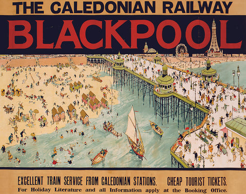
Like Hassall, Tony Sarg was one of the biggest names in pre-First World War illustration famed for his humorous, and often crowded, depictions of English life. This busy poster was probably designed to be overprinted with the names of different railway companies as part of joint marketing campaigns, but it’s significant that this example promotes the Scottish Caledonian Railway as Scotland became a major target for the Corporation’s advertising efforts. Designed to be closely studied on wintry platforms, Sarg’s design shows a summery holiday destination bursting with fun activities, with the principal attractions (the Tower, Ferris Wheel and Winter Gardens) prominently silhouetted on the skyline.
Blackpool For Gorgeous Sights, Great Central Railway/Wilton Williams, c. 1919
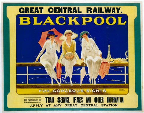
It’s not clear whether this poster was produced solely at the expense of the Great Central Railway company or jointly with Blackpool Corporation, but it enjoyed wide distribution at the time. Wilton Williams’ slightly risqué design (well, risqué for the time) quickly establishes a sense of place by positioning the Tower and Wheel next to the fun loving and fashionable day trippers basking in the summer sun. Of course, the reality could be rather different, as the Derbyshire Courier pointed out a few years earlier: “The new Blackpool poster is on the walls and it shows a bathing-lady reeling on sunlit sands, and dabbling her tootsies in the rippling waves. Unless they have a peculiar local brand of climate on tap …the young lady has my sympathy in advance. See seems to be asking for an attack of cold feet.”
Blackpool. The Zone of Ozone, 1920s
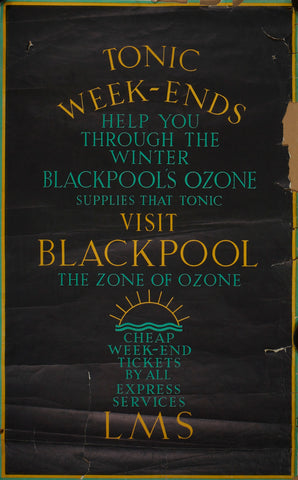
While we worry about the depleted Ozone layer today, the term was used in the 20s and 30s to describe the supposedly health giving seaside breezes marketed here as a ‘tonic’ to ‘help you through the winter’. Like Scarborough, which was advertised as being ‘SO Bracing’, there is an admission here that the weather might not always reach Mediterranean levels on the English coast! But the point is that for many of the town’s regular visitors, drawn from the industrial midlands and north-west, Blackpool air was a welcome break from the smog ridden streets of home.
Blackpool for Healthy, Happy Holidays, Claude Buckle, 1930
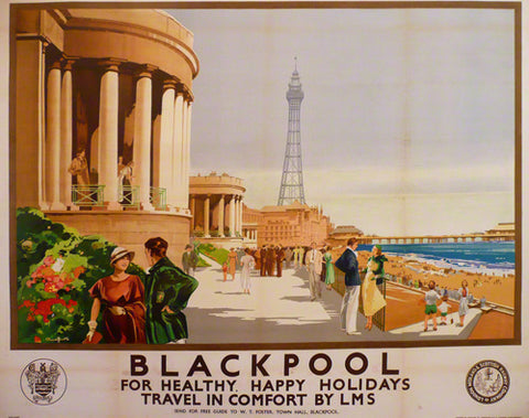
The famous Tower dominates this image of fashionable young couples and families parading on the recently refurbished Promenade, leaving viewers in no doubt that they are in Blackpool rather than Brighton or Morecambe. The Corporation’s Publicity Director, William Foster, was instrumental in forging joint marketing campaigns with the mainline railway companies, as can be seen here by the inclusion of the town’s crest alongside that of the London Midland and Scottish Railway Company.
Blackpool, Fortunio Matania, 1937
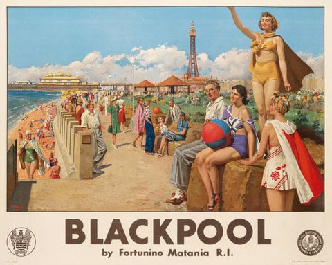
Surely one of the strangest Blackpool posters of the interwar years, featuring a gold-costumed youth whose ‘wave’ looks suspiciously (and presumably unintentionally) like a Nazi salute! This is another example of joint marketing between Blackpool Corporation and the LMS railway company. It was designed by the Italian artist Fortunio Matania, who was also employed by the Blackpool Tower Company in the mid-1930s to paint a series of watercolour images for brochure illustration.
Lancashire, Lancashire Industrial Development Group and the Travel Association, Ralph Mott, c.1935
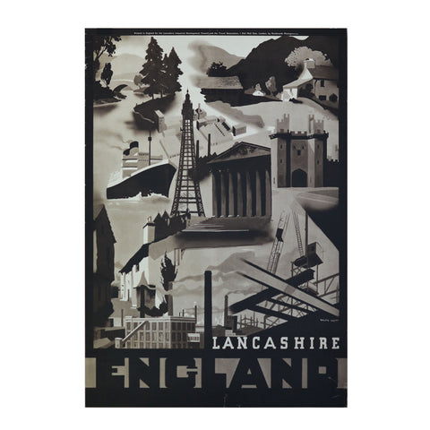
The recognisable ‘brand’ value of Blackpool Tower ensured that it was used in broader advertising campaigns promoting the whole of Lancashire. In this case it features as part of a design commissioned by the Lancashire Industrial Development Group and the British Travel Association to encourage new manufacturing and tourism to the region. This rather mixed message was paid for by subscriptions from participating towns (including Blackpool) and businesses with the resulting posters displayed across the UK and overseas.
Stock poster, 1930s
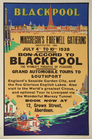
By the 1930s many visitors arrived at Blackpool by coach. Every year the Corporation distributed thousands of blank ‘stock’ posters to the various bus operators with ample space for overprinting excursions details. This example has been overprinted with information regarding a 1938 trip from Aberdeen to Blackpool, showing the geographic reach of the town’s advertising department.
Blackpool, BR/Abram Games, 1952
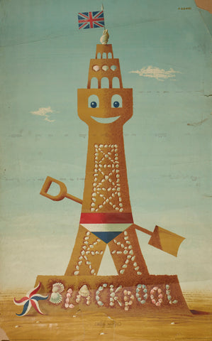
Partly due to the available advertising budget and also to its status as Britain’s most popular resort, Blackpool has been depicted by some of the country’s greatest poster artists. This outstanding design by Abram Games is a case in point. Fresh from designing the logo for the 1951 Festival of Britain (the influence of which can be seen in the Union flag themed starfish), Games skilfully combines the town’s most famous landmark with that most trade mark achievement of a British seaside holiday – the sandcastle. Known locally as ‘the shell tower’, the poster was paid for by British Railways, but in testimony to the renown of both the town and the designer the company’s logo is barely visible at the base. Games’ design was later awarded the British Resorts Association annual poster trophy.
The Lancashire Coast, British Railways/Daphne Padden, 1962
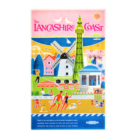
One of my favourite posters of Blackpool by the wonderful Daphne Padden. All of the distinctive landmarks are prominently featured, including the Tower, historic windmill, pier and Pleasure Beach. The latter was (and still is) a privately run company, with the result that it’s often absent from advertising paid for by Blackpool Corporation! Apart from its all-round cheerfulness, what I especially like about this poster is the misleading way it makes Blackpool look like a sunny peninsular with the sea on both sides.
Stock poster, 1960s
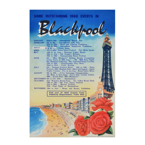
Blank ‘stock’ posters continued to be published well into the 1960s, either for local use or wider distribution. This example, from 1968, inevitably features the Tower together with a bouquet of Lancashire red roses (the county emblem), overprinted with a range of seasonal activities. Among the many delights on offer are the International Slipper Fair, the Miss Blackpool Bathing Competition and (of course!) the Illuminations.
Blackpool lights, Bob Rushton, c.1975
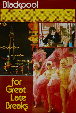
Blackpool’s famous autumn ‘Illuminations’ began in 1879 as a typically entrepreneurial way of encouraging out of season visitation. In the early years the sight of electrically lit street decorations was novelty enough. Later the Illuminations became more varied and spectacular, marketed under the slogan "The Greatest Free Show on Earth" - not always with the unquestioning support of local ratepayers who actually paid for them! This year’s Illuminations run from 2nd September to 6th November.
Blackpool – Don’t, Rubbish Seaside/Jack Hurley, 2014
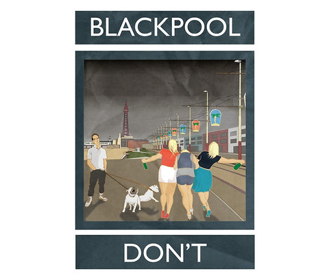
Blackpool’s reputation today is not what it once was. Somewhat unfairly, the town is now probably more associated with Stag and Hen parties than family holidays, and the area has certainly seen its share of social problems over the years. But then that’s probably true of most British seaside towns. In 2014, the artist Jack Hurley began a brilliant series of updated holiday posters entitled ‘Rubbish Seaside’, which he says is ‘one man’s love letter to the thin drizzle of disappointment that is the British Coast’. It’s unlikely that many in Blackpool would agree, nor the 13 million people who visit every year (with record numbers expected for 2016). Yet even this jokey image continues much of the visual language of earlier years: the Tower, Illuminations and, erm, youthful ‘fun’!
Acknowledgements
In putting this post together, I am indebted to the very generous guidance provided by Barry Morris, Blackpool’s former Director of Tourism, and also to the ever helpful Tony Sharkey of Blackpool Local History Library. Thanks, too, to Susannah Walker of Quad Royal blogging fame and all-round poster Tsarina. And, of course, Emma Heslewood, curator with the Blackpool Museum project. None of whom are in any way responsible for my half formed ideas or choice of poster imagery.

Comments on post (1)
Mick says:
Brilliant posters, love the history behind Blackpool and love the Imperial Hotel, the North Pier & theTower particularly the Ballroom & Circus.
Shame that some areas have become run down but still something special about the place!!
Leave a comment