
In November 2017 two poster-based exhibitions opened in London. The first, at London Transport Museum (LTM) in Covent Garden, championed the neglected role of women designers in the story of C20th British poster history. The second, at the Jewish Museum (JM) in Camden, examined the extraordinary influence of European émigré designers on Britain from the 1930s onwards.
I was lucky to be involved with both exhibitions, and it was while working across the two sites that I first became aware of the striking similarity between a couple of featured designs by Sheila Stratton (LTM) and FHK Henrion (JM). Both were commissioned by London Transport in the 1950s, and their remarkable likeness raises intriguing questions about artistic influence and lasting fame.
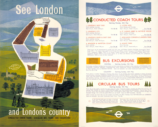
The first poster, or rather pair poster, See London and London’s Country, was designed by Sheila Gillian Branthwayt Stratton (1928-2008) in 1954. One half of the design features an outline of a possibly female form with one arm raised and the other holding a London Transport guide book. The body is formed from a collage of London landmarks, including Big Ben and Buckingham Palace. The second half of the pair poster (which would have been displayed alongside the main image) contains more practical information about bus and coach tours in London and the surrounding countryside.
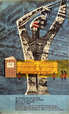
The second poster, Visitors London, was designed by Frederick Henri Kay Henrion (1914-1990) in 1956 – two years after Stratton’s design hit the hoardings. Like the earlier poster, it features the outline of a possibly female form, with one arm raised to the head and a body formed from an inverted image of the Eiffel Tower intersected with an illustration of Buckingham Palace. But the similarities don’t end there. Both posters use very similar colour schemes with the main figure imposed on the background. Look, too, at the common use of the London Transport roundel logo for the mouth, the use of a bold defining white line on the left of the figure and the positioning of open LT guidebooks to the centre left of the designs. Even Stratton’s placing of miniature trees in the foreground is mirrored by Henrion’s diminutive guardsmen.
Now, I’m not saying that these two posters are identical, but they bear more than a passing resemblance. And in keeping with London Transport Museum’s narrative that women designers have been somewhat overlooked in the story of poster history, it is revealing to note that Henrion’s design is the better-known today, having been republished in anthologies of Underground posters and repurposed for souvenirs. In contrast, I can’t recall having seen Stratton’s poster before, although it was reproduced in the German design magazine Graphis at the time as an outstanding example of British commercial art.
One reason for this neglect, of course, is that Henrion is by far the more famous of the two designers. Born Heinrich Fritz Kohn to Jewish parents in Nuremberg, Henrion studied poster design in Paris under the direction of Paul Colin. He came to England in 1936 to further his career and escape the growing Nazi threat. Briefly interned during the war as an 'enemy alien' because of his German birth, Henrion went on to produce outstanding propaganda on behalf of the British and American governments in London. After the war, he became a renowned pioneer of corporate identity, as well as a highly regarded teacher at the Royal College of Art and the London College of Printing.
In comparison, Stratton’s career is frustratingly difficult to piece together. Born on the Isle of Wight, she trained at Canterbury College of Art and the Royal College of Art. A member of the Royal Institute of painters in water colours (RI), she appears to have worked as a graphic designer in the 1950s with clients including London Transport, the publisher Jonathan Cape and the cosmetics retailer Gala of London.
All of this may seem like a rather academic comparison between two similar posters that nobody seems to have commented on at the time. But there’s an interesting coda to the story, as Henrion and London Transport were sued over a copyright infringement on Visitors London, but not by Sheila Stratton.
The central image of Buckingham Palace on the Henrion poster was by another female artist, Judith Bledsoe, and her agents (Archives Designs Ltd) were far from happy about its uncredited use. After a flurry of legal letters, LT eventually agreed to remove the poster from circulation and pay a fine of £150 plus costs to the artist’s agent. LT was also instructed to recall any copies that had been distributed for review or private purchase - presumably with the intention that they should be destroyed.
At first Henrion was nonplussed by all the fuss, complaining to LT’s Publicity Officer, Harold Hutchinson, that the one disputed “element” did not “take away from its merits as a design” and hoped that the poster might be re-issued in the future. Hutchinson had other ideas, however, replying on the 8th April 1957: “I can only repeat that we cannot allow any further use of the Eiffel Tower [sic] poster for any purpose or in any way whatsoever”.
Despite this injunction, a few copies of Henrion's poster escaped destruction, one of which is available for sale here. Other surviving examples can be seen in the London Transport Museum collection, along with Stratton's excellent but, until now, neglected design.

Comments on post (1)
Pat Elaine says:
David, Your documented research into these fascinating details of poster history continues to amaze me and assist my efforts to research female poster artists and their works. I can’t tell you how much I look forward to your newsletter and how it enlightens us all. I know how especially difficult this is WRT females artists and am continually in your debt.
Leave a comment